Trappe Digital LLC may earn commissions from sponsored links and content. When you click and buy you also support us.
As your livestreams continue to improve one thing to consider is to use designed video background images. That means that you have a designed background that stays up throughout the show and that offers some brand consistency from episode to episode.
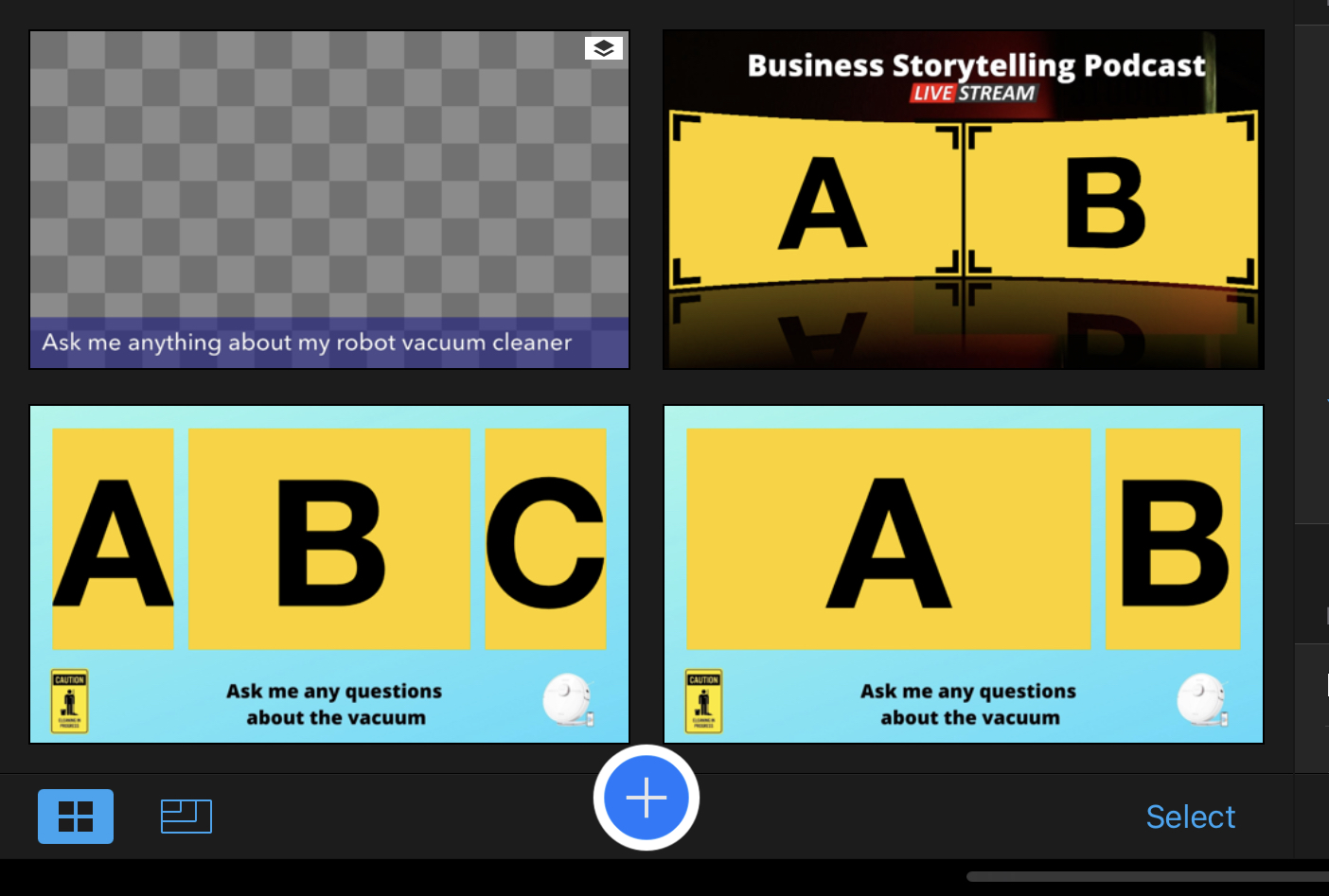
Here’s how that looks for my new video background for the Business Storytelling Podcast livestream.
 I used my cover and episode promotion art. Then I deleted my image and the guest image. Finally, I uploaded it to Switcher Studio as a background.
Simply go to add multiview template and in there it gives you the option to upload a background image.

Other livestream production platforms like Restream also offer the functionality to upload backgrounds. Of course when I actually go live myself and the guest will appear where those two placeholder images are currently appearing.
I worked on something similar for my robot vacuum show on Amazon Live. Without the background it looked like this. There are typically three views on the screen. One of them being me, one being the vacuum cleaner and one being the map of the cleaner.

The designed video background looks like this.

The easiest way to design video background images
Of course the easiest way is to ask your designer to do it. I’m not a designer but I use Canva constantly. I basically eyeballed where the screens are and then I created a new image using the presentation template size in Canva.
From there I moved the creative assets around until they fit on the screen. For example, on my first try it didn’t work and looked like this.
 That’s an easy fix though. I just had to shrink down the vacuum cleaner and the other image and I was set to go.
I also would recommend to keep some brand consistency with your background. For example, with my podcast that simply just meant that the background should look similar to the cover art. I use a version of the cover art to promote specific episodes and those look like this.
I just removed the portraits and then covered up the “on air” wording by duplicating with a screenshot the colors from the left.
That looks like this in Canva.
 While that’s not perfect and wouldn’t work if I use the image as is it does work on the livestream because a big chunk is covered up by the speakers. I also had to move up the wording some and centered it.
Certainly, I wouldn’t make background images a high priority when you first start with your livestream podcast. Once you get going and have all the right equipment and are a few dozen episodes in it might be worth trying.
Having a standard branded background certainly can make a show look more professional and consistent. Plus, they’re relatively easy to produce.


